
Heyo im Elia,
I design & build software
to generate smiles & profit :)
Work



Misc feed
Rilay
•
IOS
I’m building an app that makes shared effort feel social & playful with a passing relay torch.
Map Jumper
•
IOS
Exploring a quicker way to navigate between places.
Pinch to fold map gesture
•
IOS
Joyful way to store and open maps
New map tool
•
IOS
Felt for a long time like drawing on a map should be a default feature with maps, so I'm building it :)
FYNO diagnostic result
•
Web
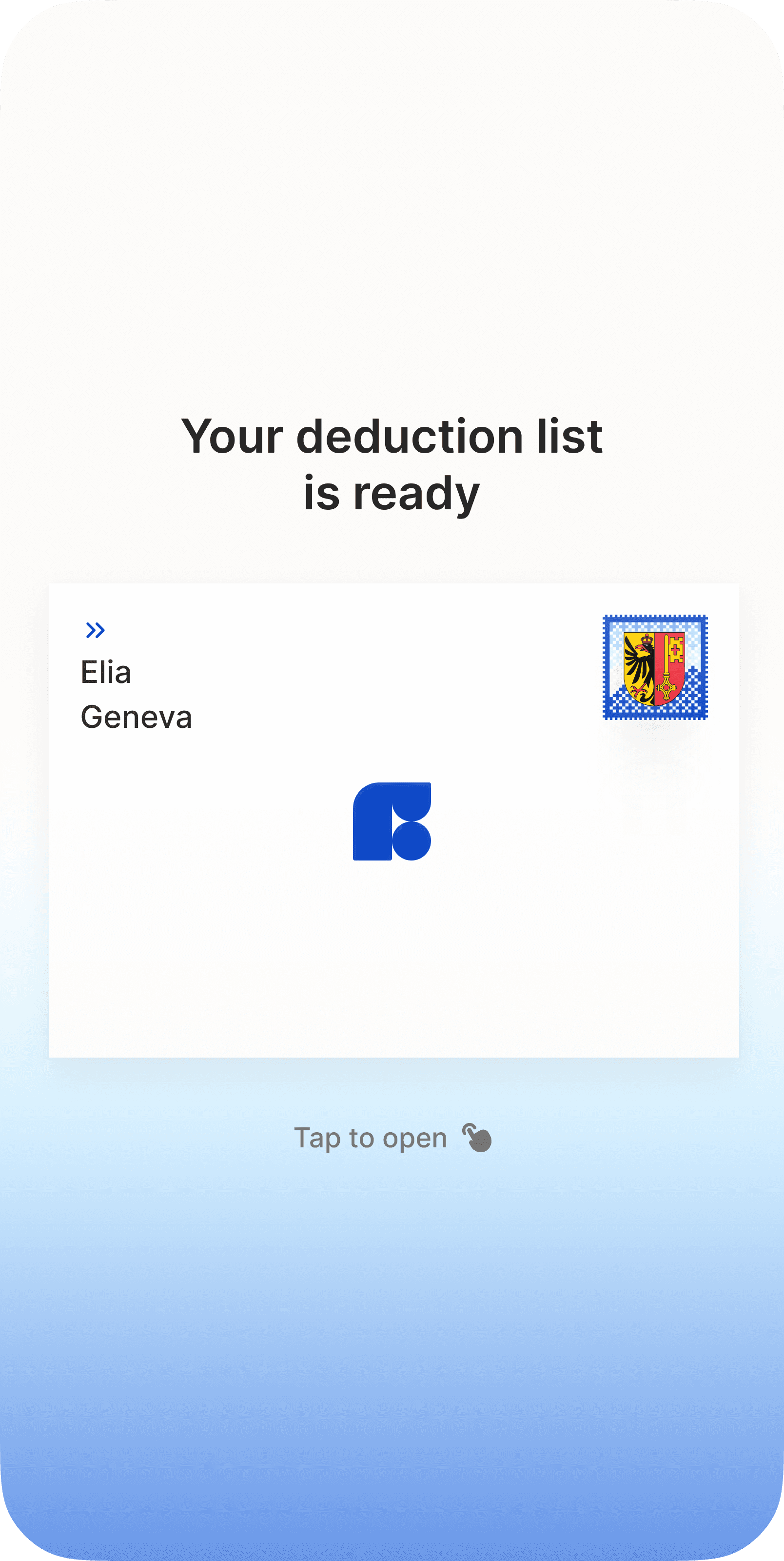
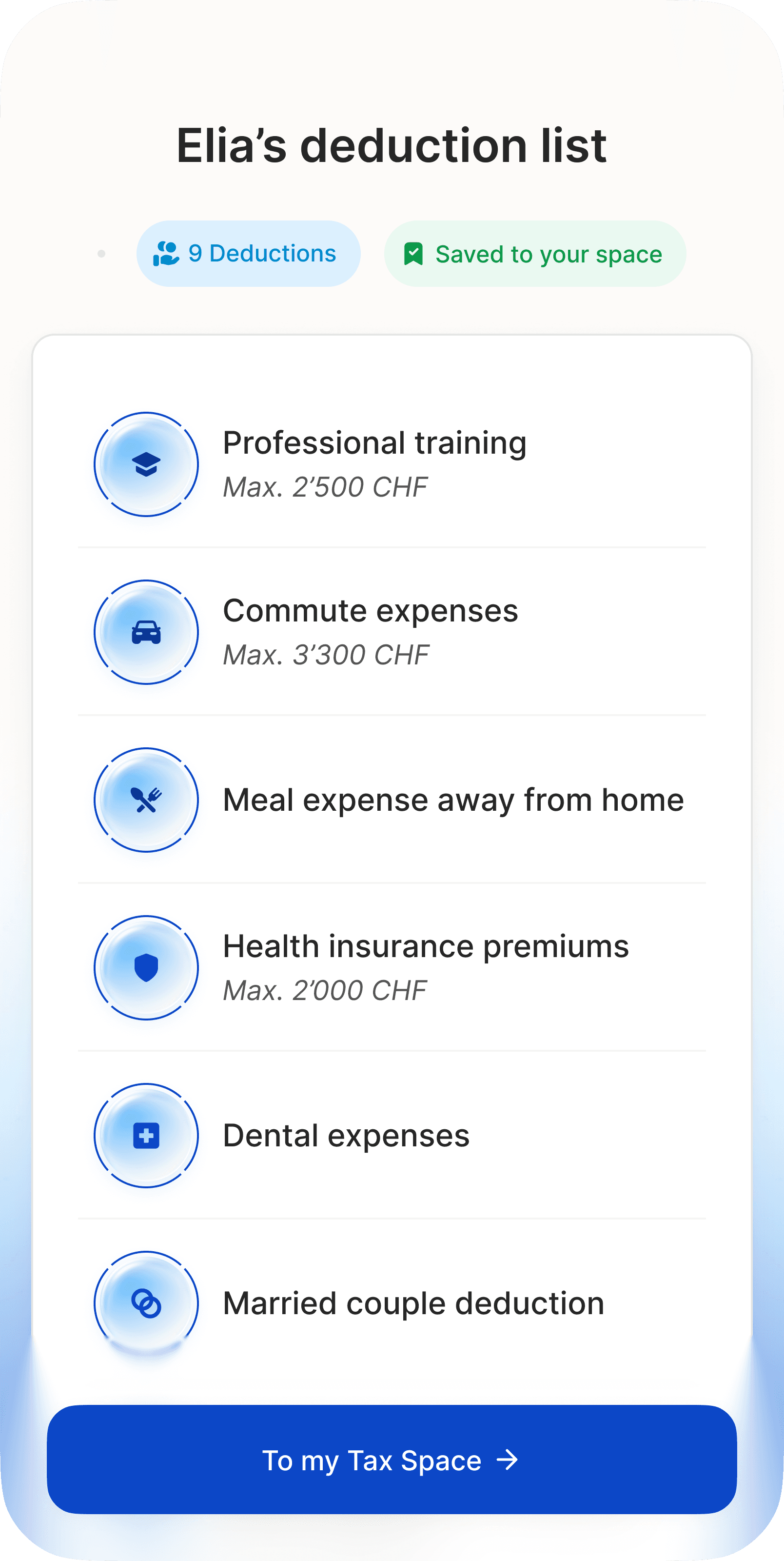
Building a new 5 min financial diagnostic for FYNO, we are experimenting with playful personas to educated users on their financial situation.
Stretch to expand SwiftUI prototype
•
IOS
I am experimenting with drag behaviors that feel physical and playful. Tweaking an element's movement to create a sense of a resisting spring that unleashes
at a certain threshold.
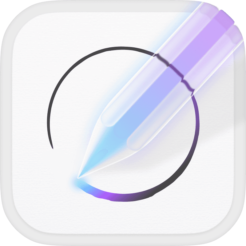
Unravl app icon
Unravl was a voice to text tool made to help you clarify your thinking. I wanted to bring a sense of a magical companion that helps you form complete thoughts.
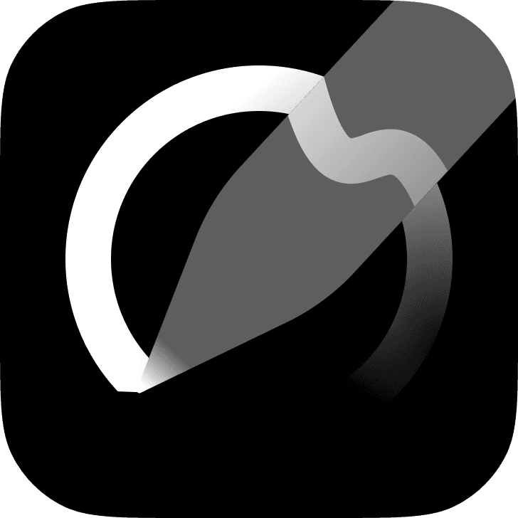
Unravl icon app exploration
As a product aiming to bring clarity, I wanted to explore a minimalistic version. This variant didn't make the cut as it didn't emphasize the helper aspect of the product enough.
I built this prototype to test how Dia could bring even more fluid interaction between browsing and the AI chat. Matching the intent of bringing your tab in to context with a simple drag.

FYNO giftcards
A fun brand use of Swiss mountain motif in a collectable product card.

FYNO logomark exploration
A logo exploration we left behind. It was special but felt too outdoorsy.
I started my own side project experimenting with how browsers could feel more human out of curiosity for the space. With the internet being a place I learned so much through, I asked myself how the browser could encourage and afford curiosity. I built this prototype to test a fun interaction which would let you dive deeper into any text you see on a website with an AI summary and quick way to continue your curiosity path through common knowledge platforms.

FYNO is here poster
While designing the FYNO brand, I built an aesthetic from painted Swiss scenery and financial graph lines, mixing approachable familiarity and energetic growth.
I played with a poster announcing "FYNO is here" to give the founder a sense of how this aesthetic could be used in different formats.
Arc concept: "Arc navigator"
A less serious play with Arc, dressing it with a Netscape Navigator style UI to mix early era and cutting edge browser design.
ROSE app icon variant
A fun color variant for the ROSE app icon I designed. The new ROSE icon brought rose compass elements to communicate a sense of direction in a world of confusing advice and legal requirements.
Custom icon for ROSE Projects
ROSE's Projects feature came from a deep rethinking of the product's architecture. I wanted to celebrate this work by designing a unique iconography for it using elements from the new ROSE icon. I took our compass arrows and made an icon that symbolizes progress and a clear direction, matching the functional nature of our Projects feature.
While experimenting with animated Framer components, I started having fun building expressive cursor components with added personality. I picked 6 and wanted to share them in the Framer community platform so other makers could use and remix them. To package them nicely, I built a literal unboxing experience to unveil the components in a way that feels exciting and tactile.
About
Originally from Israel, currently living in Amsterdam :)
Beyond design stuff, I am improving my boxing skills,
discovering new music, and eating gelato.